Thursday, May 22, 2014
I'm a Horticultural Purist: Red Sunflower
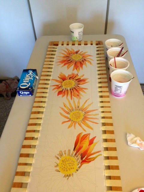
When I dreamed of this scarf five years ago, I pictured these marvelous explosions of orange on a black background. Another one of my "little black dress" inspirations. I could picture someone wearing this colourful creation during a night out at a place where colour might be lacking. Everyone donning their penguin suits, a uniform black and white; and then, there walks by a lady with personality. It's funny what artists think of when creating a piece of art. No one would look at a Van Goh and says, "Yes, he pictured this hanging in a kitchen", - Although, that's what I think sometimes.
I decided to make a few changes to this scarf when I began to resist it. Some ladies at my boyfriend's work were mentioning that they didn't like the stems in some of my scarves. Everyone is entitled to their opinion, but the piece in question was a Hollyhock and the stalk of a Hollyhock is how a flower grows; therefore, I feel it essential to place it in. Otherwise, it becomes some abstract bastardization of the glory of nature; however, as I said, if you want me to paint it without, I will paint it without. I think I'm a horticultural purist sometimes.
In the end, I decided to omit the stems from this design. Not because of the opinions of others; but, because I wanted a "firework" effect. Amazing explosions of orange, yellow and red emerging from a chocolate brown backdrop. Admittedly, this design might have been more powerful if I had made the background black; but, somehow I wanted to make it a little less cold. Now, instead of a night at the opera, this scarf has transcended to a less pretentious purpose. A lady or gentleman could sport a brown leather jacket and these magnificent Sunflowers will pop against it. I hope I will be able to make some more colourful and tropical scarves in the coming months. The brilliant blues which can clash against fiery reds and hot pinks can be quite striking. If you think that this scarf is vibrant now, wait until I steam it. You're going to require sunglasses just to look at it.
Thursday, May 15, 2014
Mucha Peony Scarf 1
Unfortunately, I couldn't come up with a title with more creative than that. It seems as though all of my creative juices have been squeezed from me today, and all that is left is this pulp.
This scarf took me a couple of days to just resist. There was so much line work that I had to go back and refill both of my bottles.
The first picture was one full day worth of work because I had to finish the lines and then get the first of the blossoms in. Truthfully, it didn't take as long as I thought it would.
These last two took me a day to complete. I think the entire scarf took me three full days of work, from resist to finished product.
I hope I have chosen the colours correctly. Seeing as I wanted to make all of them a part of a series, I think my decision has been a sound one. For some strange reason, I feel that I have everything all planned out until I come to the finishing touches. Perhaps, I'm feeling slightly frustrated with reality at the moment. Naturally, I paint so that I one day hope to sell my creations. Unfortunately, others have informed me that a less-than-reasonable price for my work might be extravigant. I say this with the full realization that since the invention of the printing press, artists like myself have been rendered, pretty much, obsolete. We are competing with a market that we cannot stand up in. Trying to explain to people why you deserve what you price your art for feels completely absurd to me. If you want to take minimum wadge, which in Ontario is $10.25, and apply it to how many hours it takes me to complete a scarf, such as the one that I have finished today, that is, just to paint it; you would be paying somewhere in the area of $246. That is not including the price of materials. If anyone would ask me to justify my price I would love to respond with this:
"Imagine that your employer dragged you into their office tomorrow and said that you were no longer worth whatever your hourly salary was. Instead, your time was now worth half of what it was before. Would that be acceptable to you?".
Naturally, it would not. No one would find that kind of treatment acceptable; so, why should I?. Why should artists be shortchanged for their time, skill, and effort?. Is it because there are so many of us?. Has the printing press really put us out of a job?. I don't know. I'm sure I will be back in love with silk painting when I start again this weekend. I'm just feeling slightly exasperated because my feet hurt and my back aches after bending and reaching over a table for hours. I love what I do, and I'll be damned if anyone will discourage me.
This scarf took me a couple of days to just resist. There was so much line work that I had to go back and refill both of my bottles.
The first picture was one full day worth of work because I had to finish the lines and then get the first of the blossoms in. Truthfully, it didn't take as long as I thought it would.
I hope I have chosen the colours correctly. Seeing as I wanted to make all of them a part of a series, I think my decision has been a sound one. For some strange reason, I feel that I have everything all planned out until I come to the finishing touches. Perhaps, I'm feeling slightly frustrated with reality at the moment. Naturally, I paint so that I one day hope to sell my creations. Unfortunately, others have informed me that a less-than-reasonable price for my work might be extravigant. I say this with the full realization that since the invention of the printing press, artists like myself have been rendered, pretty much, obsolete. We are competing with a market that we cannot stand up in. Trying to explain to people why you deserve what you price your art for feels completely absurd to me. If you want to take minimum wadge, which in Ontario is $10.25, and apply it to how many hours it takes me to complete a scarf, such as the one that I have finished today, that is, just to paint it; you would be paying somewhere in the area of $246. That is not including the price of materials. If anyone would ask me to justify my price I would love to respond with this:
"Imagine that your employer dragged you into their office tomorrow and said that you were no longer worth whatever your hourly salary was. Instead, your time was now worth half of what it was before. Would that be acceptable to you?".
Naturally, it would not. No one would find that kind of treatment acceptable; so, why should I?. Why should artists be shortchanged for their time, skill, and effort?. Is it because there are so many of us?. Has the printing press really put us out of a job?. I don't know. I'm sure I will be back in love with silk painting when I start again this weekend. I'm just feeling slightly exasperated because my feet hurt and my back aches after bending and reaching over a table for hours. I love what I do, and I'll be damned if anyone will discourage me.
Monday, May 5, 2014
Sunset Dahlia
Another weekend passes and another scarf is completed. This is not exactly what I had hoped the final product would look like. However, I must remind myself that it is not yet done the process. This scarf still has to be steamed and washed, and through those processes the dyes will become more vibrant, some will fade, and the overall look will change once I have finished. I'm sure that someone will find this one beautiful somewhere. It's the trouble with this medium, you can hope and plan the best you can, and in the end, it just might not turn out the way you wanted it to.
Now, this one was tricky. I extended the petals to the ends of the scarf and this is dangerous. Most of the time, the resist will not hold at the edges and it will bleed into an area that you don't want the dye to go. I have not yet found a way around this problem, except to never extend my lines beyond the boarder and if I do, like as in this case, I use very light washes. This way, if any bleeding occurs it will not be as noticeable. It's a cheat, but I would like to eventually find a way around this problem. There must be a way that it can be done. In the meantime, I will have to do with resisting layer upon layer at the boarder on both sides of the scarf; in hopes that those layers will be able to dam the bleeding dye. I will give that a try next time and see if it will work.
The greatest tragedy about this art form is that it does not make a ton of money. Therefore, a lot of artists who practice silk painting will offer courses and make books of techniques on order to make extra cash. These courses mostly focus on teaching people the basics, like making very abstract designs using salt and resist, which is where we have to start I suppose. However, artists are very stingy when it comes to divulging how they do things. Which is phenomenally frustrating to people like myself who are completely willing to give tips to people without asking them for money. I once e-mailed this silk painter in England asking him how he got rid of his resist lines. This artist replied to me stating, "If you want to know, you can buy my book and it will be able to tell you". The cost of shipping his book from England, PLUS the fact that his book cost 30 British pounds did NOT make it worth my while. I can understand, fine, you are a business and are in it to make money; but, ugh, information should be available to everyone. I guess I am his competition and that is one way to detour competition. Oh well, I will push on regardless of Stingy McArtist.
Thursday, May 1, 2014
Small Peony Scarf
I've finally been bitten by the joy of painting, and it's not letting me go. After completing my second scarf, and my fist smaller one, I cannot wait to get my brush in hand again. Five years ago, the Superintendent of the apartment building I was in bought two of my first scarves off of me. She was an older lady, and after the purchase she mentioned to me that it would be a good idea for me to make some smaller square ones. The reason for this is because, apparently, older women are somewhat self-conscious about their necks?. Slightly ashamed to take this advice, as I believe firmly that our "youth obsessed" society needs to grow-the-hell-up; I ordered only five 12" x 12" scarves. After all, if there is a market, why would I not carry them. The smaller scarves with a uniform shape could also be worn on the head or framed on the wall. However, no matter what the use for the artwork, it is ultimately made to be either admired for it's beauty and/or to help the wearer feel beautiful. I know it sounds vein, but it's true. Everyone wants to feel beautiful in some meaning of the word or other, even men, because after all: "The clothes make the man".
This scarf was not without it's problems. While painting the boarder some black was flecked onto the delicate pink petals. This was so upsetting to me because it's extremely hard to remove that dye once it's on the scarf. So, with much haste and fury, I took my trusty Q-Tip and dampened it; but, instead of scrubbing furiously with both the damp and dry end, while blowing like "The big bad Wolf"; I took a kleenex and placed it under the spot. After, I applied the damp Q-Tip and VOILA!. The black fleck was pulled through the underside of the scarf, another application ensured that it would mostly disappear!. Fantastic!. What was surely to ruin my scarf, was lifted away with only a couple of small places were the mistake can be seen. I know I've said this before; but, this is not an art for a Type-A personality.
Silk painting, it gives me the most joy. It's that feeling you get while you're doing what you love. I just hope that I can make a go of this small, very small business.
Tuesday, April 22, 2014
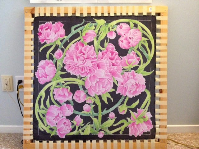
Peony Scarf
This project began in 2009 when I drew my peony template. I had this marvelous plan to make a stunning scarf of the many petaled flower which flourished in my families garden, until my home was demolished in 2012. Over the weekend, my Mother told me that she remembered where she got our peonies as they were not purchased in any store. The story goes that my Mother went over to an old doctors office in the neighborhood, as it had been gutted and left in between ownership, and she took the peonies which were planted there. She saved them and then transplanted them into her own garden along side our home. Recycled and tended to with care, the flowers were split many times over the 20+ years they thrived in our garden. With fond memories of the lush electric pink peonies which bloomed without fail, I desired to create a scarf which would reflect all of their glory.
The template, the plain drawing, took me three days to complete. I originally wanted to make the scarf without a boarder; however, anyone with any experience with silk painting knows that to paint a white scarf ANY colour at all, and keep that colour even and flawless over large areas is practically impossible. Therefore, I split my painting up using the leaves of the peony and the boarder. Until I master the art of painting larger areas without flaw, I will use the boarder to help the transition.
The above photo is three days worth of painting. As I have listed before in my blog, resist cannot keep on the silk longer than five days. The longer is sits, the more the wax within the product spreads, thus making it difficult for the dye to hug the resist lines. Something which I was experiencing into day two of my painting.
In the end, this scarf was a marvel. I have not yet steamed it and I am a little concerned with it's welfare; that is why I took so many pictures of it. This is the scarf where I have broken all of the rules of silk painting. I have not purchased any new supplied since 2010, they are expensive and I have lots and lots of the old ones. The problem with my particular silk dyes is that they are advertised to last only two years on the shelf. For mine, it's been at least five. As for the resist, I purchased and did not open 1L of resist in 2011. It has been three years, and when I finally opened it, there were little flecks of mould growing in it at the lid seal. I have shaken up all of my dyes and stirred up my resist, and the below picture is my final result.
Peony scarf: 15" x 72". I have broken every rule in the silk painters book with this one and I am excited to see what it turns out like. In the end, I am very satisfied with how it turned out and I hope to make many more in the future.
Wednesday, April 2, 2014
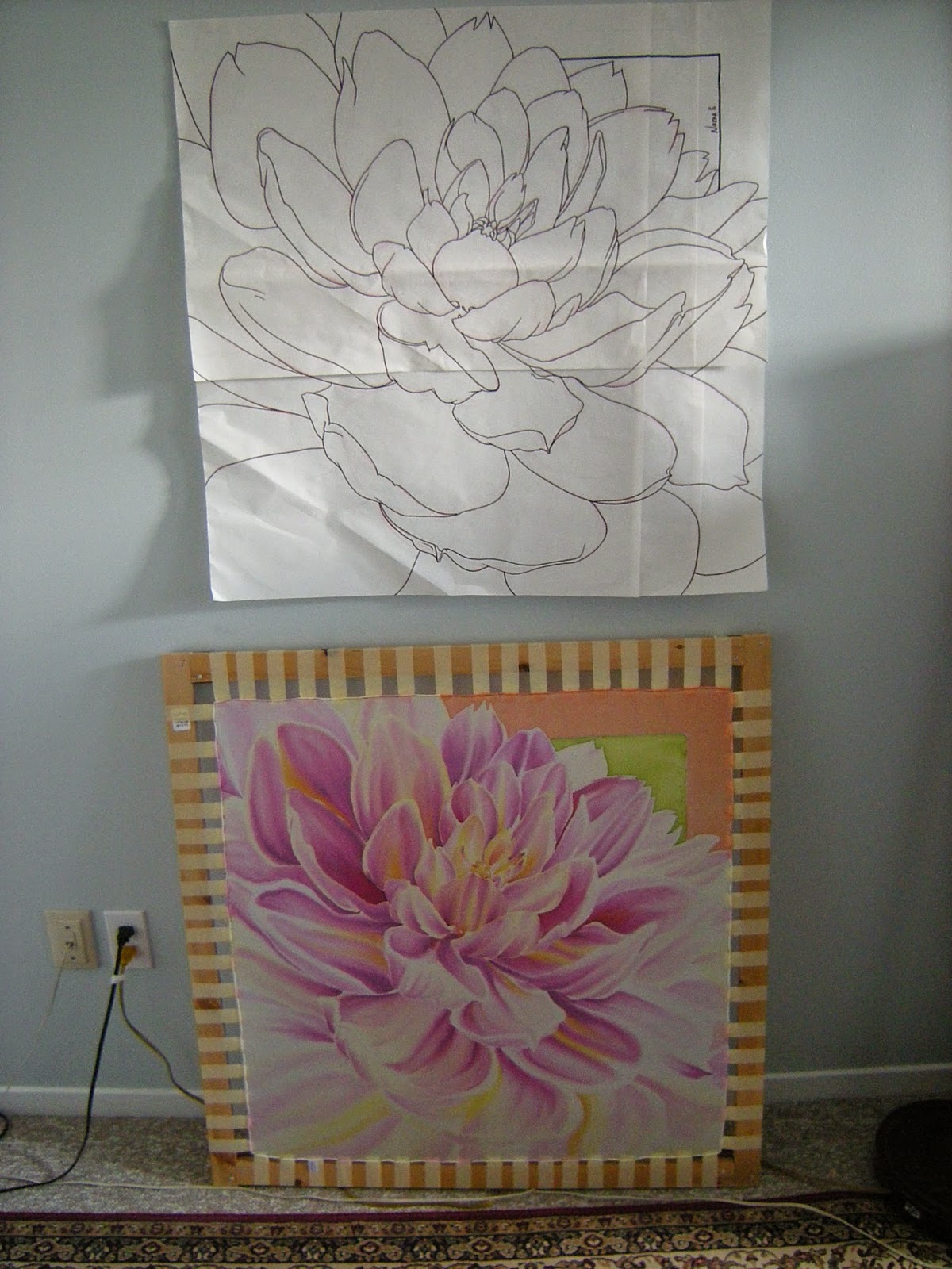
Finally: New Dahlia Designs
Dahlia: 12"x12"
It has been so long since I have updated this blog!. Finally, after
four years I can, hopefully, ignite my passion for silk painting again.
For four years I have been thinking and dreaming up different patterns
in a variety of sizes. Now, they are beginning to make their way to
paper and I could not be happier. Still the same subject matter, in
honour of my parent's garden; however, I have some ideas to spin. These
are the first templates with the last of the paper I bought seven years
ago. The new paper lacks tooth, which is a little bit of a
disappointment; but, I'm sure I'll get used to it. I look forward to
sharing the finished products with you. Keep your fingers crossed.
Dahlia: 31"x 31"

Dahlia: 10"x 55"
Friday, February 10, 2012
Everything Zen
Have you ever worked really hard at something and then after you spent all that time, effort, and love you stood back and realized what a colossal mistake it was?. I think that this scarf pretty much sums that experience up for me.
A part of my process when I design a painting is colour matching. After I purchased all of my dyes, I made colour swatches for them and super glued them to the caps of the corresponding dye bottles. This was to ensure that I had an accurate estimation of what the saturation was of the dye.
When the resist has set and I am ready to paint, I always pull out my dyes and carefully colour match as best I can. I line up all of the bottles that I have chosen, and when I am confident that the colours will look good together, I begin.
However, there is one thing that I cannot account for - BLENDING. When I was in high school, one of the exorcises we had to complete in painting class was blending our own tints, shades, and hues of colours with only three paints. You know those colour swatches on the bottom of your cereal box?. Yup, those are what we had to use in order to come up with over 140 colours (plus white for the tints). It was a FANTASTIC exorcise, and I think the one that I did which really gave me confidence and understanding of colour. Unfortunately, liquid silk dyes are not student grade acrylic paints and are unpredictable.
Some dyes are more dominant than others and that means that the more dominant dye colours will cling to the silk better than the non-dominant. This scarf is a perfect example of that. The yellows I chose for the dahlia were Bright Yellow and Yellow with a little bit of Citron Green. My ratio of Yellow was low and Bright Yellow was high so that the deep yellow would not overpower the Bright. But, when it came time to steam and wash, the darker yellow didn't hold. I lost the boldness of the yellow and the result is a washed out looking yellow Dahlia.
You can imagine how upset I was when I saw this. This scarf took me hours and hours and I went over each petal several times with different brush thicknesses to get the desired effects. My low back was killing me after bending over for so long and my feet ached like I'd been walking for hours. After all of that care, and love, it didn't turn out.
This is one of the scarves which didn't sell. I see it as a failure, which as an artist we are taught to never admit. You are always to brazenly push your art upon a viewer with no apologies!. This scarf I do regret. The design held special meaning to me as my family used to run a seasonal flower business. The business is how I got through College. I was, "The Flower Girl". Every summer from the age of 16-19, our family set up shop on the corner of Oxford and Wharncliffe Rd. N in London, ON and we would sell Gladioli and Dahlias. Dahlia's were my Dad's favorite flowers, and the Yellow one was his absolute favorite. It's blossoms could grow larger than your face. When this scarf didn't turn out how I had wanted it to, I was so upset.
This scarf taught me a valuable lesson about being extra cautious about choosing your dyes. It also opened my eyes to accepting things beyond your control, which is something I have trouble with.
In my day job there is always a "right" and "wrong" way of doing a drawing or executing an animation. It's always your fault when what you do isn't good enough because you can always erase and make it better. In this art form, you have NO control over the outcome. Sure you can recognize which dyes work which ways, but as for the final result, you will never know until the piece is ironed.
Even though I view this as a failure, I still think that it's a marvelous piece in parts. I'm happy I learned more about blending with dyes when I painted this. Now, I know to not get too emotionally attached to what I am doing and try accept that the chips will fall where they may.
Subscribe to:
Posts (Atom)